 Menu
Menu

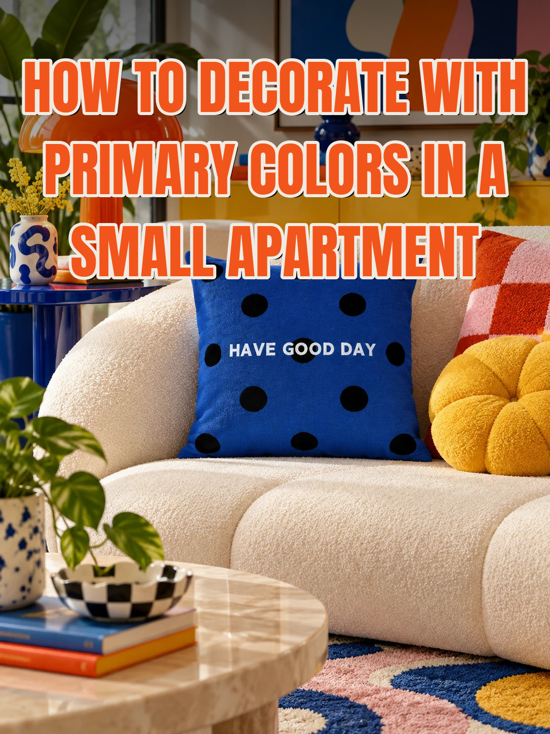
It's Sunday, 4 p.m. You saved a red, yellow and blue living room three weeks ago and you still love it. Then you picture those colors in your own rental, with its white walls and its hand-me-down sofa, and all you can see is a daycare.
Give each primary a different volume: one leads, one supports, one whispers. Blue takes the largest pieces, red gets one mid-size piece below eye level, and yellow stays small. Keep the walls and sofa neutral, add one black line, and repeat every color at least twice. Red, yellow and blue only look childish when all three shout at once.
That's the short version of how to decorate with primary colors when the room is small and the lease says no paint. The rest of this guide gives the proportions, the placement and the things worth skipping.
Why do primary colors look childish in the first place?
Primary colors look childish when they arrive in equal doses, on shiny plastic, at full brightness. That's the recipe for toy packaging and classroom furniture, so that's what the room reminds you of. The colors aren't the problem. The proportions and the finishes are.
Color researchers have a name for this: context. A 2014 review in the Annual Review of Psychology concluded that color "can carry important meaning" and can affect how people feel and behave, but that the meaning depends on where the color appears (Elliot & Maier, 2014). The authors also call the field "nascent" and warn against strong recommendations, so treat this as a useful idea, not a law.
The same honesty applies to "dopamine decor." Nobody has measured dopamine spiking at the sight of a red stool. What researchers have measured is more modest: among 988 people working in real offices across four countries, the authors found that good color design "might contribute to a more positive mood" (Küller et al., 2006). That's a nudge, and it's the reason to get the palette right instead of avoiding it. We go through the rest of the evidence in does dopamine decor actually work.
How to decorate with primary colors without the playroom look?
Split the three colors unevenly, roughly 60, 30 and 10. Decorators use the 60-30-10 rule for whole rooms: a main color, a supporting color and an accent (National Association of Realtors). In a rental the walls and sofa are already neutral, so apply the split to the color you add on top.
| Role | Share of the color | Where it goes | Best primary for it |
| Leader | About 60% | Rug, cushions, one large print | Blue |
| Support | About 30% | One mid-size piece below eye level, plus one small echo | Red |
| Whisper | About 10% | Two small objects, one of them on the wall | Yellow |
You can swap the roles. A red-led room with blue support works too. What doesn't work is thirds, because three equal colors give the eye nowhere to rest.
Which primary color should lead in a small apartment?
Blue should lead in most small apartments. It's the only primary that stays calm at a large size, and decorators have long treated cool colors as receding and warm ones as advancing. That's a rule of thumb, not a measured finding, but it matches what you see: a blue rug sits back, a red rug comes at you.
Put the leader on soft surfaces first. Textiles cover the most area for the least commitment, and they leave with you when the lease ends. Start on the sofa, where a deep blue reads against a neutral cover from across the room.

A patterned cushion does this job better than a solid one because it carries two blues at once. A blue polka dot throw pillow at 45 x 45 cm (18 in) is big enough to register on a three-seat sofa without a second one beside it.

How much red is too much in a small room?
More than one mid-size piece is usually too much. Red is the loudest of the three, so it needs the tightest limit: one object about the size of a footstool or a lamp, placed below eye level, plus one small echo somewhere else. Keep it off the walls. A red wall in a 12-foot room sets the mood for everything, and in a rental it's a repaint you pay for.
Shade matters as much as size. Fire-engine red on glossy plastic is the classroom version. Tomato or brick red on fabric, wood or matte metal is the adult one. If the room already feels busy, go a shade darker before you go smaller.

Low seating is a good place for it, since red at floor level warms a room without sitting in your eyeline. A heart-shaped accent footstool takes up 50 x 50 cm (20 x 20 in) of floor and pairs a red top with blue gingham sides, so it ties the support color to the leader.
Where should yellow go?
Yellow should go where you want the eye to land, in the smallest dose of the three. It's the lightest primary, so a little of it travels a long way. Two placements are enough: one on a wall or shelf at eye level, one lower down, such as a book spine, a bowl of lemons or a cushion.
Keep yellow away from the big surfaces. A yellow sofa or rug turns the scheme into a yellow room with accents, which is a different project.

The wall is where a single round object does the most work. A flat wall clock in one solid primary is 30 cm (12 in) across and comes in yellow, red or blue, so you can give it whichever role the room is still missing.

What keeps red, yellow and blue from clashing?
Black lines and empty space keep them from clashing. This is the oldest trick in the palette. When Piet Mondrian and Theo van Doesburg founded De Stijl in 1917, the style allowed "only primary colours and non-colours": red, yellow and blue held apart by black, white and grey (Tate). Those paintings hang in museums, not nurseries, and the non-colors are the reason.
At home, the non-colors are a black lamp base, a black picture frame, a white wall left bare. One black line per view is enough. Then repeat each color at least twice so nothing looks like an accident. We covered the repeat rule in should picture frames match and the counting in what colors go with a beige couch.
The palette has a second adult pedigree. In the early 1980s Ettore Sottsass founded Memphis, a design group known for "bright colours, geometric shapes and bold patterns" (Design Museum). On our own Pinterest account this fall, two of the biggest pins were plain color formulas, and the largest was a red, yellow and blue room. People aren't looking for permission to use these colors. They're looking for the ratio.
Do primary colors make a small room feel smaller?
Not by themselves. What shrinks a small room is the number of separate things in view, and saturated colors make every extra object easier to notice. Count the colored objects you can see from the sofa. If you pass nine, remove before you add.
The evidence here is about clutter, not color. In a survey of just under 1,400 people, clutter tracked with a weaker sense of home and lower life satisfaction (Roster, Ferrari & Jurkat, 2016). That's a correlation, and nobody in it was counting cushions. Still, it's a fair argument for more color on fewer objects. The same logic runs through our guide to styling shelves without clutter.
What should you skip?
- Equal thirds. One red, one yellow and one blue cushion in a row is the playroom look in its purest form.
- Glossy plastic in all three colors. Change the material when you change the color: fabric, wood, matte metal.
- A fourth bright color. Green or orange can join later as a plant or a book. Not as a fourth cushion.
- Buying everything in one weekend. Put the leader down, live with it for a week, then add red.
The cheapest test costs almost nothing: stack one red, one yellow and two blue books on the coffee table and look at them for a few days. If you'd rather commit through textiles, our colorful cushions and throws are the easiest pieces to move or swap. Orders ship free to the US and Canada with duties included, are inspected before dispatch and are replaced if damaged in transit, as set out in our shipping policy.
One leader, one support, one whisper, a black line and some bare wall. The room you saved three weeks ago was built on that ratio, and it fits in 450 square feet.
FAQ
Can you use primary colors in a bedroom?
Yes, with blue leading and red kept very small. A bedroom is a place to wind down, so shift the split toward the calm end: blue bedding or a blue rug, one yellow object, and red only as a detail such as a book spine or a lamp cord. Darker, dustier versions of all three are easier to live with at night.
What neutral goes best with red, yellow and blue?
Warm white or cream, with a little black and some natural wood. Cool grey makes primaries look harsh, and beige can turn yellow muddy. White rental walls are an advantage here, because they act as the empty space that keeps three strong colors apart.
Is a primary color scheme the same as dopamine decor?
No. Dopamine decor is a cultural name for decorating with colors and objects that make you happy, and it can use any palette. A primary color scheme is one specific palette inside it. No study shows decor releasing dopamine; the research on color and mood is real but modest.
Do you need all three primary colors in one room?
No. Two primaries plus black and white is a complete scheme, and it's the easier place to start. Blue and red is the most forgiving pair. Add yellow last, in one small object, and decide after a week whether the room wanted it.
Decorate your mood.
Not sure which color should lead in your room? Our two-minute vibe quiz picks a palette for you.
Retro Radius Team
Share:
Should Picture Frames Match on a Gallery Wall?
Should Throw Pillows Match the Rug?